GIMGANE, a pioneer in the South Korean restaurant business, is leading the way in the country's restaurant industry.

GIMGANE, a pioneer in the South Korean restaurant business, is leading the way in the country's restaurant industry.

We will operate the company under the principles of trust, honesty, and love.

Trust means credibility and
confidence.
If the headquarters did not give faith
in taste and quality to the franchisees,
and the franchisees did not give it to the customers, today's GIMGANE would
not exist.
The long-standing tradition and craftsmanship of GIMGANE are highly valued for creating lasting brand power in the minds of customers.

Honesty means that words
and actions align
When the headquarters and franchisees each fulfill their roles centered
around the customer,
that's when the customers can trust and seek them
out, and the brand becomes one that is beloved by customers.

What GIMGANE values most is love.
While culinary expertise is important, food should also be infused with the
dedication and care of the people who prepare it.
GIMGANE strives to provide
food that embodies
the warmth of a mother's love,
from ingredient
selection to service.
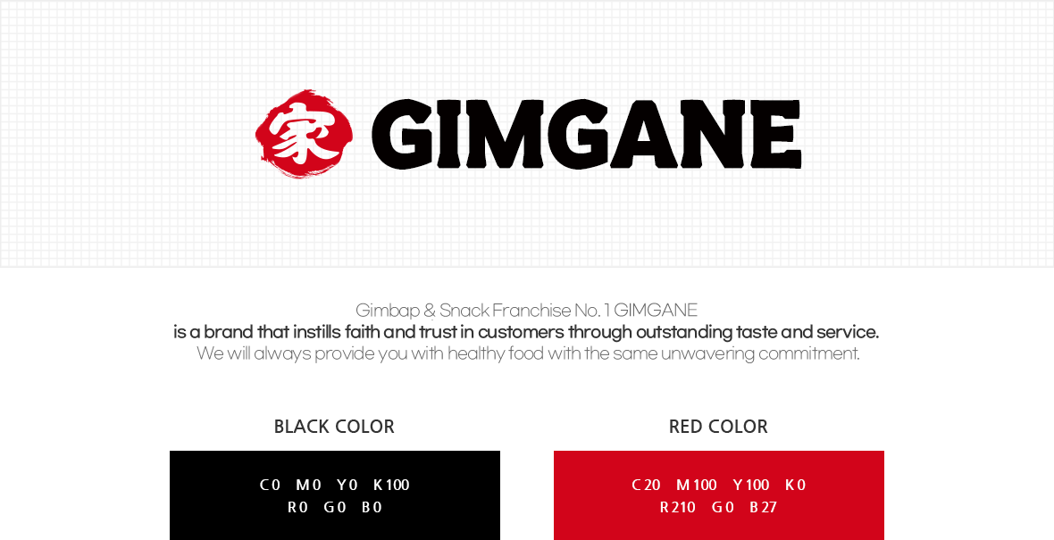
The CI design for GIMGANE incorporates the symbol mark and colors from the
early days of the brand identity,
intending to carry forward the legacy of the
long-established 30-year brand.
The circular shape of the symbol mark
symbolizes gimbap, with the small circle within representing the ingredients
of gimbap.
The half-circle below signifies the half-seaweed that wraps
around gimbap ingredients.
The black color represents the color of seaweed,
which is the basis of GIMGANE, and the red color signifies life and love.
In this
CI design, Daehakro and Gimbap have been removed and replaced with
"Since 1994," emphasizing GIMGANE's tradition.
